How-to Create Seamless Mobile App Signup
If there’s one thing that’s incredibly frustrating, it’s signing up for an app.
You know the drill; download the app, add your name, email, or connect your account via Facebook. Then enter a password, add your mother’s maiden name and your favorite food for security purposes, prove you’re not a robot hacker, etc. It’s exhausting. We get it.
What if the mobile app sign-up process was efficient? What if you didn’t have to include your pet’s name, your first best friend, or your favorite food? Making the app sign-up process efficient is possible:
Ditch the multiple steps
The more steps there are post-download, the easier it is for users to delete your app. Asking to supply a variety of personal information will not make the experience user-friendly; only give them a few simple steps to complete in order to keep the process as simple as possible.
The little things matter
After you’ve downloaded the app, you expect the experience to be positive. The little touches really do make a difference, especially when it comes down to providing an efficient experience. If you’re about to enter your email address, and have to switch to a variety of keyboards just to get to the “@” button on your device, it’s not user-friendly. However, if you’ve integrated the correct keyboard qwerty you’ll give users a simple and efficient experience.
Quality Over Quantity
Users want a minimalist experience, featuring simple colors, design, and user-interface, to give them a positive experience. The more distractions on a screen can be overwhelming – think quality over quantity. Some characteristics of minimal web design include using flat interfaces that do not include extra gradients, shadows, or textures that could take away from the overall site. In 95% of sampled web designs, there is a movement toward using a minimal color palette. Websites and mobile apps that consistently use minimal palettes provide a more visually appealing user experience.
Incorporating minimal design elements in your mobile app keeps the process as simple and easy to digest as possible. Afterall, 75% of website credibility is based on the website’s overall aesthetics.
At Passport, we decided to make the signup process for our mobile payment app as simple and user-friendly as possible. Just like you, we understand how frustrating parking can be. From having to circle the block more times than you can count, to handling parallel parking to circling the block again – it can be annoying. With our signup process, we wanted to make your parking experience as positive as possible. No frustrations, just simplicity.
After all, we hate those frustrating app steps just as much as anyone else. With our mobile app, the signup process is both simple and efficient – the way it should be. Download, park, and pay – the less steps, the better.
Just follow these steps and you’re ready to park and extend/manage your parking session:
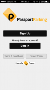
Step 1: Download the app through Google Play or Apple Store. Confirm country.

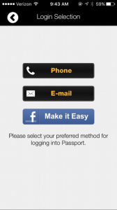
Step 2: Click ‘sign up’. Choose either phone, email or Facebook as verification method.
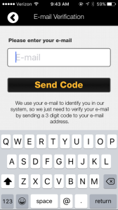
Step 3: Receive verification pin via email or phone. Enter code.
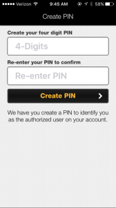
Step 4: You’re ready to park!
Download the app through the Google Play or Apple Store
Simplicity goes a long way. A signup process that user’s can easily navigate can transform the customer’s overall experience. Creating an experience that’s both positive and simple can transform the user’s overall opinion on your product or service.