Heat Mapping Will Add Value to Enforcement
If you’ve heard any term in business over the last five years, it’s probably ‘big data’. From obscurity to ubiquity, powerful companies with deep coffers have flooded the digital airwaves with the term. Complex intelligence platforms are touted with the ability to analyze heaps of data and turn it into action. We get it already.
However, if you have ever used one of these tools, it can be a little overwhelming. Big data seems more like a big task.
Fortunately, there are ways to demystify big data and make it more understandable. More actionable. For busy managers, learning and using data systems isn’t ideal. Insert data visualization. Visualization computes data sets and presents them in clear and concise ways. People are able to quickly look over graphs or pictograms and get a glimpse of performance.
 One data visualization technique that is especially useful is the heat map. Heat maps are particularly powerful for one main reason – it’s nice to look at. It’s a new twist on an old adage. A nice picture is worth more than a thousand rows of data. Heat maps take those rows and assign different colors for an immediate visual summary. Most heat maps present the information in four main hues, each with a significant meaning:
- Green : represents a low quantity of an item
- Yellow : represents a moderate quantity
- Orange : represents a significant quantity
- Red : represents a very dense quantity
While the colors may change, the constant is the representation of data-cluster activity. The idea is the more activity, the darker the color.
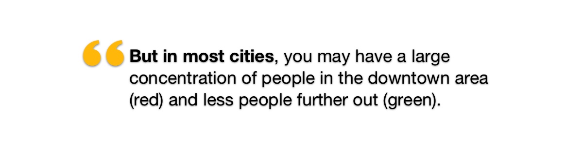
For example, if you were looking at the population of New York City, there would be a lot of red areas in the heart of the city–and well, pretty much everywhere else. Ok, bad example. But in most cities, you may have a large concentration of people in the downtown area (red) and less people further out (green). It would be very easy to see where people live. For city planners, or even retailers, this could help identify where to place the next library, coffee shop, or outlet mall.
Heat maps are extremely useful for parking enforcement departments. Imagine looking at a spreadsheet full of ticket data. This may consist of how many tickets are written, a zip or beat code, and an officer name. Poring over rows and rows is not only harsh on the eyes, but doesn’t immediately show you a story. No one has time to dig for answers in Excel cells.

With a heat map, all of that data is plotted over your parking environment. The more tickets written in any one area, the greater the “heat” that is applied. Areas where a few tickets are written might register as light green, where streets that are prone to many tickets will populate in red. This gives managers quick insight into how officers are performing in the field and helps identify areas of focus.
From a 50,000 foot view across the city, ticket density can easily show sections of concern or accomplishment. As managers zoom in to the street level, they can begin to identify how even different sides of the street impact ticket issuance. This could help uncover issues such as missing or hidden signage. It could also lead to a re-evaluation of parking rates and times. From one dashboard view, you can also:
- Share insights with team members and employees
- Tell stories from your data
- Identify trends
- Make more data-driven decisions
Because of the versatility of heat maps, parking enforcement departments can better plan and schedule. Managers can use directed enforcement efforts to areas of high activity in order to better accommodate for volume spikes.
The heat map for ticket density is included in Passport’s parking enforcement platform. As officers issue parking tickets, that data is captured in real-time in our back end system and displayed on a map of your city or university campus. Along with other report features, such as GPS tracking for enforcement officers, it is easy to get a full view of your operations.
With troves of data sitting at our fingertips, fully assessing and making sense out of it can be a Herculean task, but doesn’t have to be. To get a better understanding of how your city is performing, start using heat maps to visualize the data in more color.